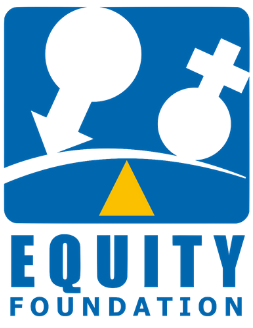
The Logo in brief represents what Equity Foundation stands for. The background is the universal set of populace representing the world. Colour ‘BLUE’ was specially chosen for its natural association with colour of the globe. The symbols of ‘Venus and Mars’ represent the female and male population of the world. Both the symbols are placed on the two ends of an arch which is in the act of achieving the state of balance with a ‘Yellow’ triangle acting as a balancing point. Traditionally in India the colour ‘Yellow’ has stood for ‘BUDDHI’ or ‘WISDOM’ since ages and is believed to affect a person’s intellect. Universally also the colour represents gaiety and harmony, thus the ‘Yellow’ serves best for the balancing point. In the end the composition graphically depict an act of balance between two entities and serves as the face for the foundation.

The logo has been designed by Ashish Asthana, a Visual Artist, National Institute of Fashion Technology, Patna University, Patna.
Visiting Faculty:- National Institute of Fashion Technology India
